

Ready to freshen up the look of your home, but overwhelmed with the colour options?
Do you have a hard time envisioning how that tiny square on a paint swatch will look on an entire wall?
We’ve been there too.
We’ve learned to trust our design team: Michelle Yates and Laura Carter.

Michelle and Laura- our design dream team (and all-star Mommas, wifeys, and about 1800 other titles and responsibilities!)
Here are their TOP 5 FAVOURITE colours from Benjamin Moore- and tips on where to use them in your home!
#1: Spanish Red- CC-92
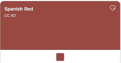
Spanish Red is THE go-to red colour for a front door. It can match most exterior colour combinations and materials (brick, wood or siding) and looks great in all light.
Spanish Red is a great choice if you want an eye-catching, bold front door without completely overpowering all your other finishes and blinding your neighbours.
(For more inspiration for your front door, check out It’s Spring: Ready to Refresh Your Windows and Doors?)
#2. Gray Owl- OC-52
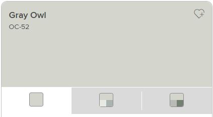
Gray Owl is our go-to colour for the interior of any space. It is a nice, warm gray that does well in any room, in any lighting. It’s not too dark to make small rooms feel tinier, and it’s also versatile as a warm and cool tone. It really does it all.
Pair Gray Owl on your walls with trim painted in White Heron- OC-57 for a dynamic duo!
#3. Swiss Coffee- OC-45
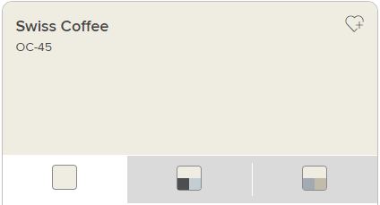
While this colour looks great in most spaces (maybe not a man cave?) we LOVE it in a kitchen. Coffee. Kitchen. It works.
Swiss Coffee is a nice pop of white that looks nice and fresh without looking clinical. It pairs beautifully with both light AND dark cupboard options as well.
A great tip when choosing colours for your kitchen: make sure to look at the colour against your countertop choices as well. It’s often surprising how many times a countertop has appeared a different colour once set up against your painted walls.
#4. Head Over Heels- AF-250.
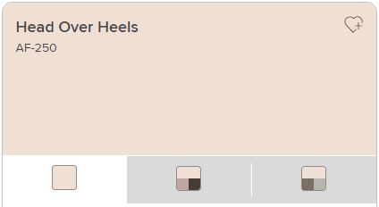
We truly are head-over-heels for Head Over Heels!
This beautiful, warm, soft pink adds a feminine touch without going ‘over the top’ in pink.
Ladies: if you’re struggling to win a colour-choosing-dispute because someone heard the word ‘pink’ and cringed- show them this shade! It looks BEAUTIFUL with navy accents as well.
#5. Hale Navy- HC-154.
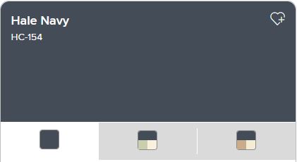
THIS. COLOUR.
Hale Navy is an excellent choice for a pop of colour on an accent wall: it delivers a punch but also invokes a calming sense of serenity to those inhabiting the space.
So there you have it: our designers TOP 5 FAVOURITE colours from Benjamin Moore to inspire your design!
Happy decorating 🙂